Client
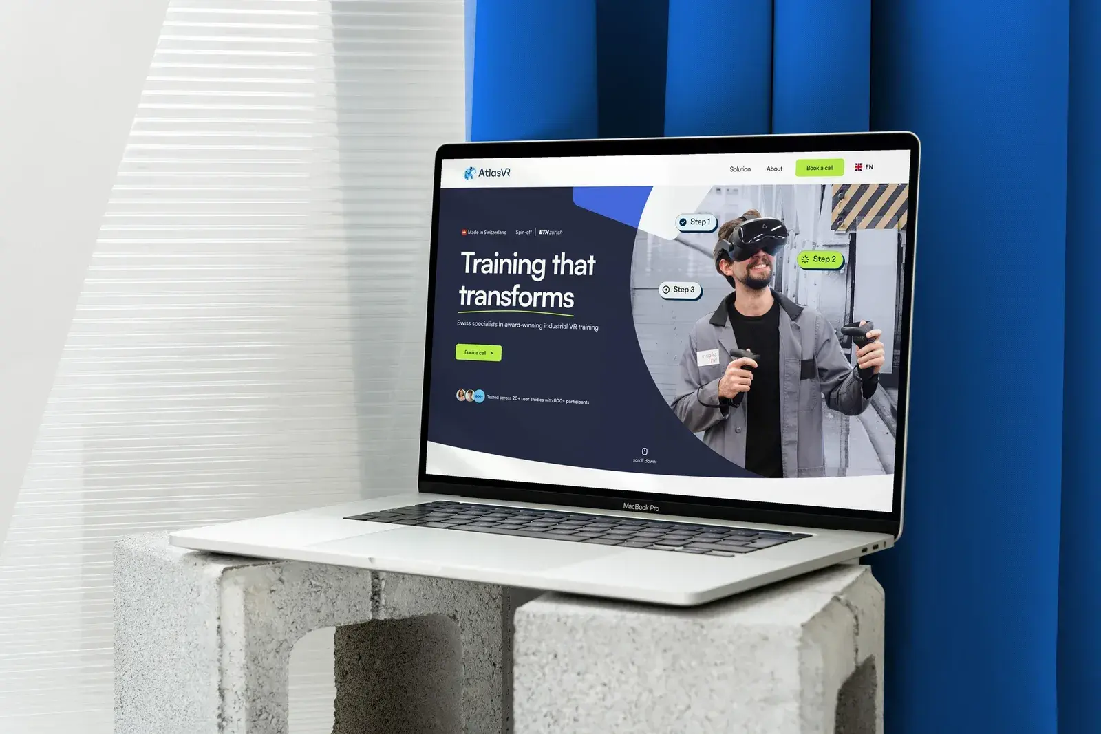
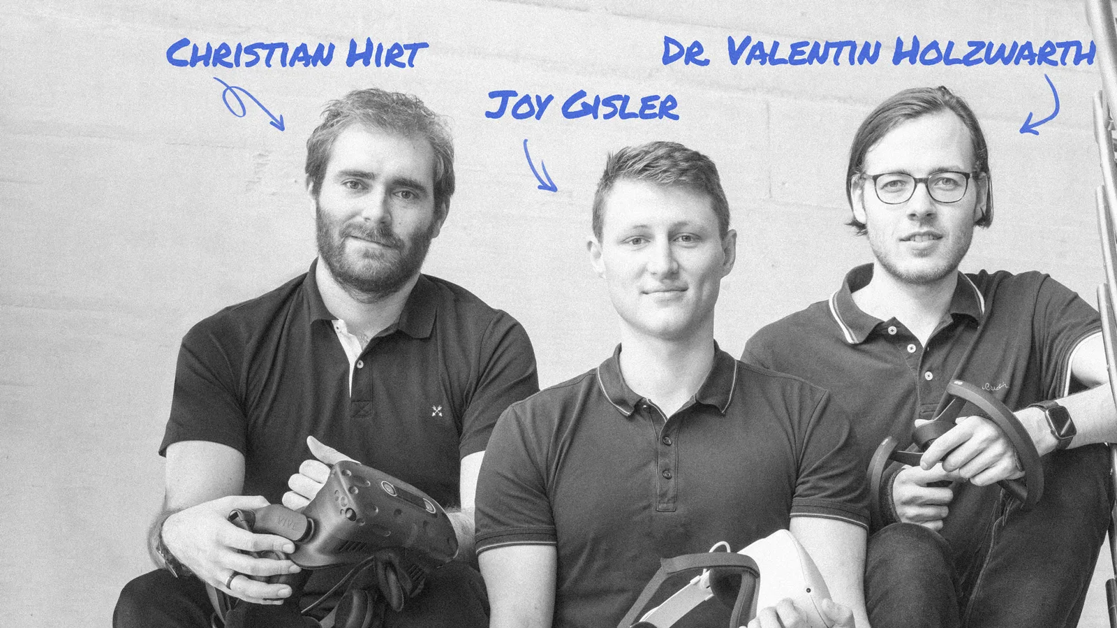
#AtlasVR, an ETH Zürich spin-off founded in 2021, builds virtual-reality training for industrial work – machine operation, building technology, assembly and safety. Its clients include Swisscom, RhySearch and suissetec.
Challenge
#The company had outgrown its first brand: a logo, a few colours and a website that no longer matched the business. It needed an identity and a site that would establish credibility with industrial buyers and bring in new prospects online. The deadline was fixed: six weeks, ahead of the final stage of Venture Kick.
Our approach
#To fit six weeks, we worked in short iterations with daily check-ins. First, with AtlasVR’s marketing manager, we agreed the audience, positioning, content and tone of voice. Design and build followed on that basis.
"The level of design that the SamuylovAI team offers is truly top-notch. Moreover, communication and professionalism were excellent from the beginning – it was clear that we were working with experienced professionals. Regular communication avoided any potential misunderstandings and allowed for a smooth flow of the process."
– Anastasia Vorontsova, Marketing manager at AtlasVR
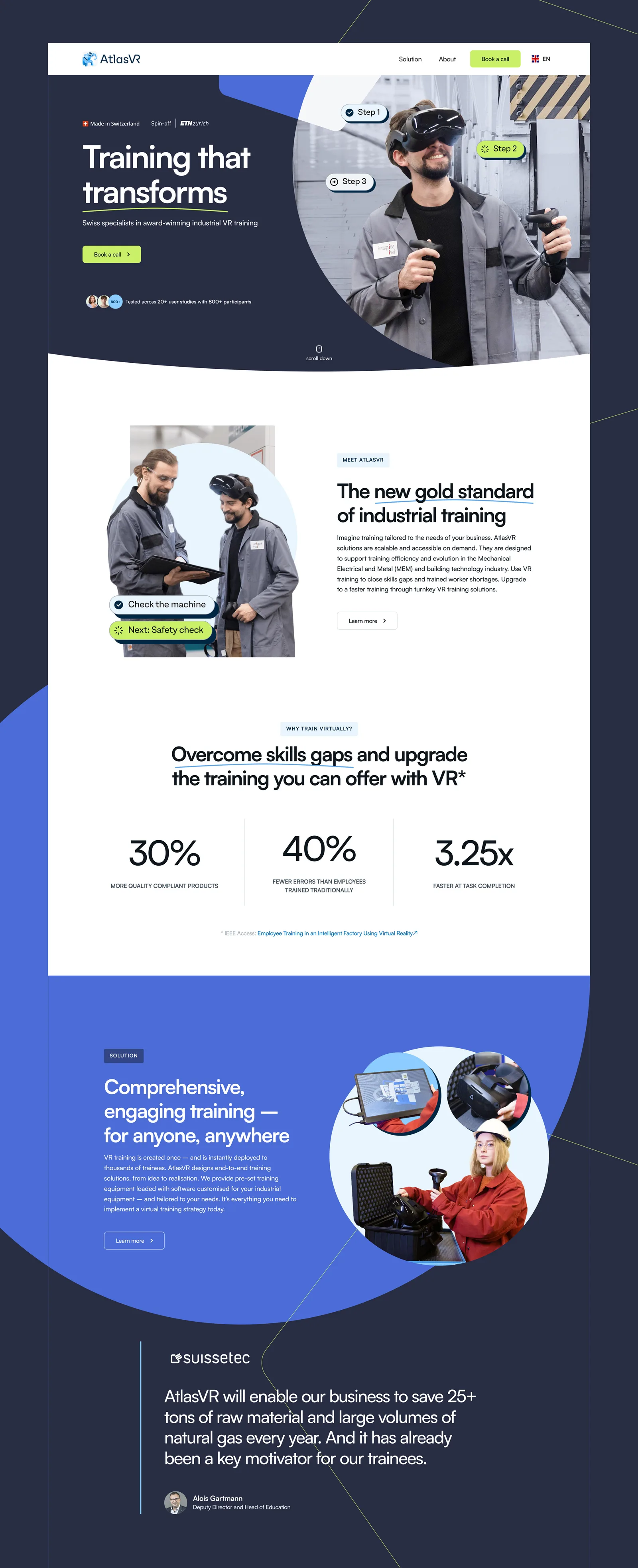
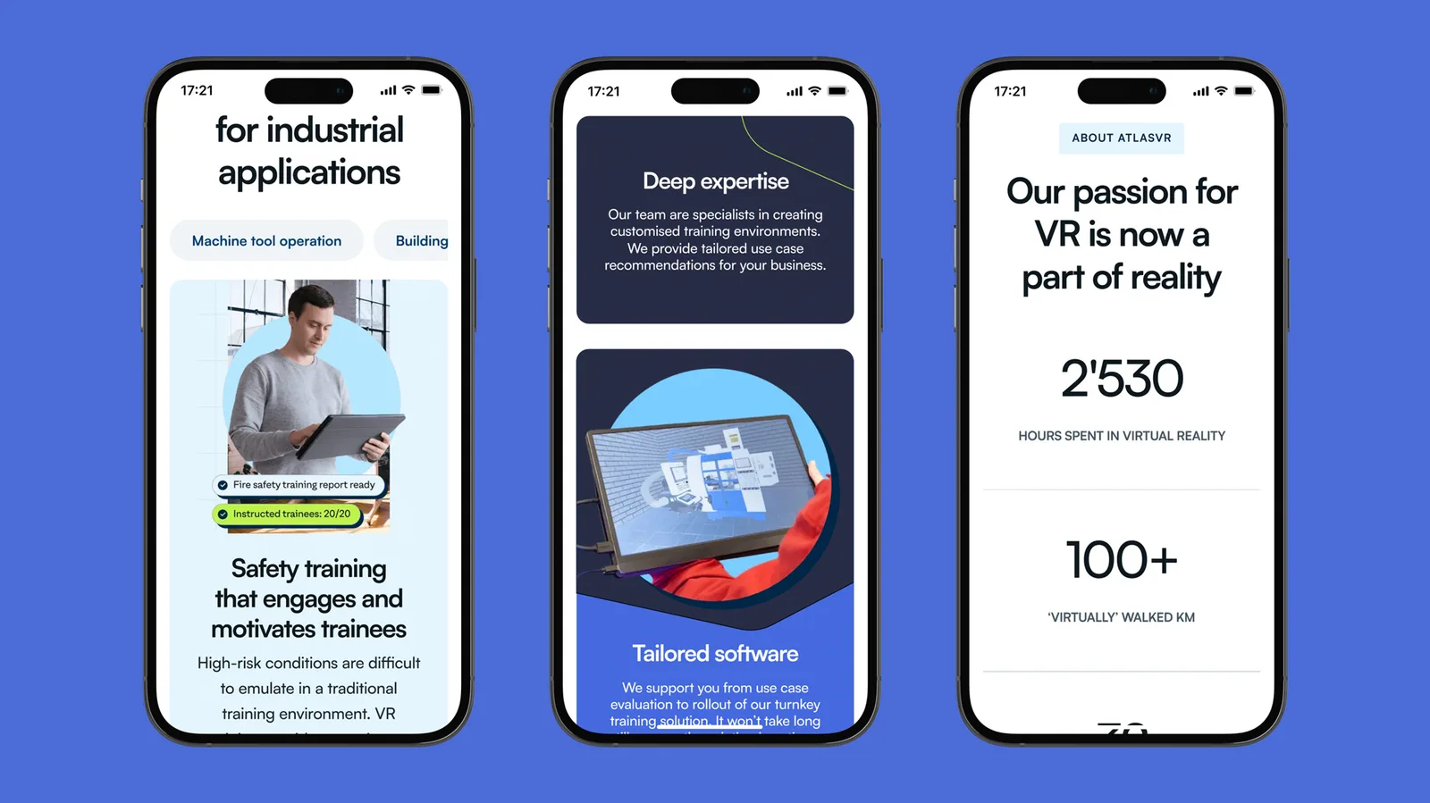
Proof before promise. The homepage leads with what an industrial buyer needs to see: research figures with their published source, a quote from suissetec, and, on the wider site, the start-up awards AtlasVR had already won.
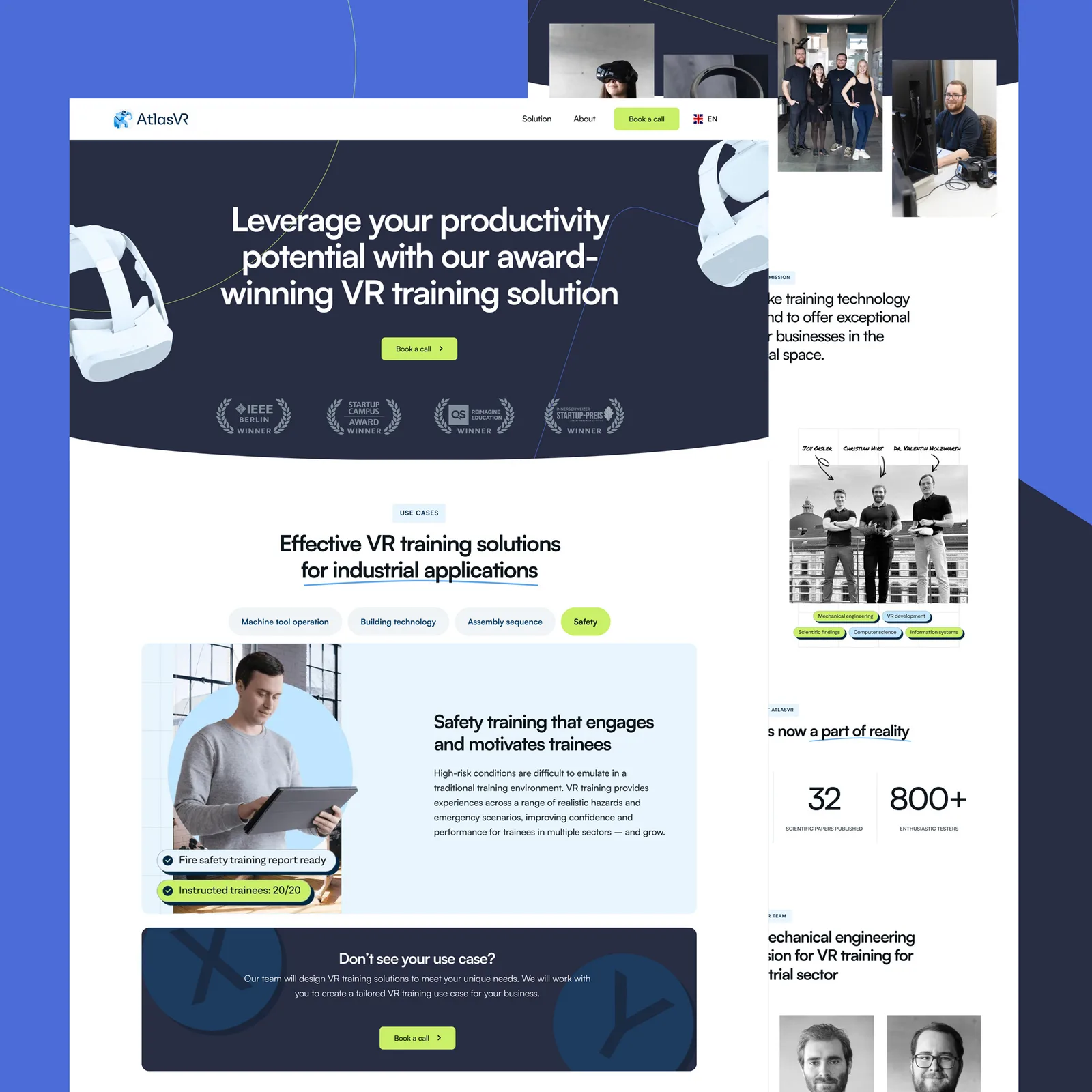
Show the training as it happens. The photography puts trainees in work clothes at real machines. Rounded labels styled as training prompts – steps, checkpoints, a finished safety report – sit over the images, so a visitor sees what a session looks like before booking one.
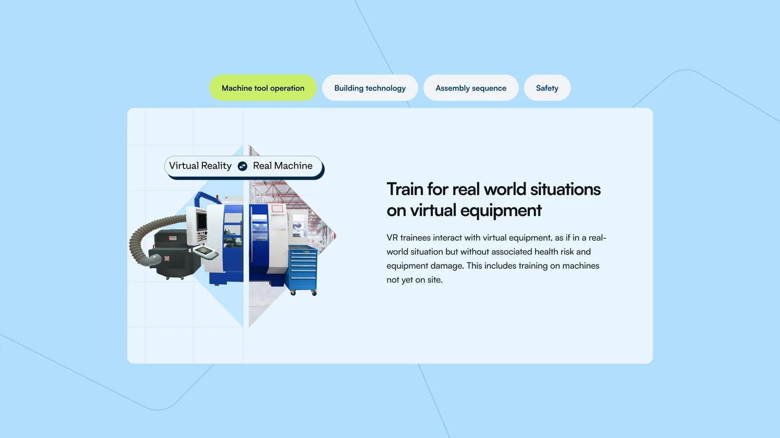
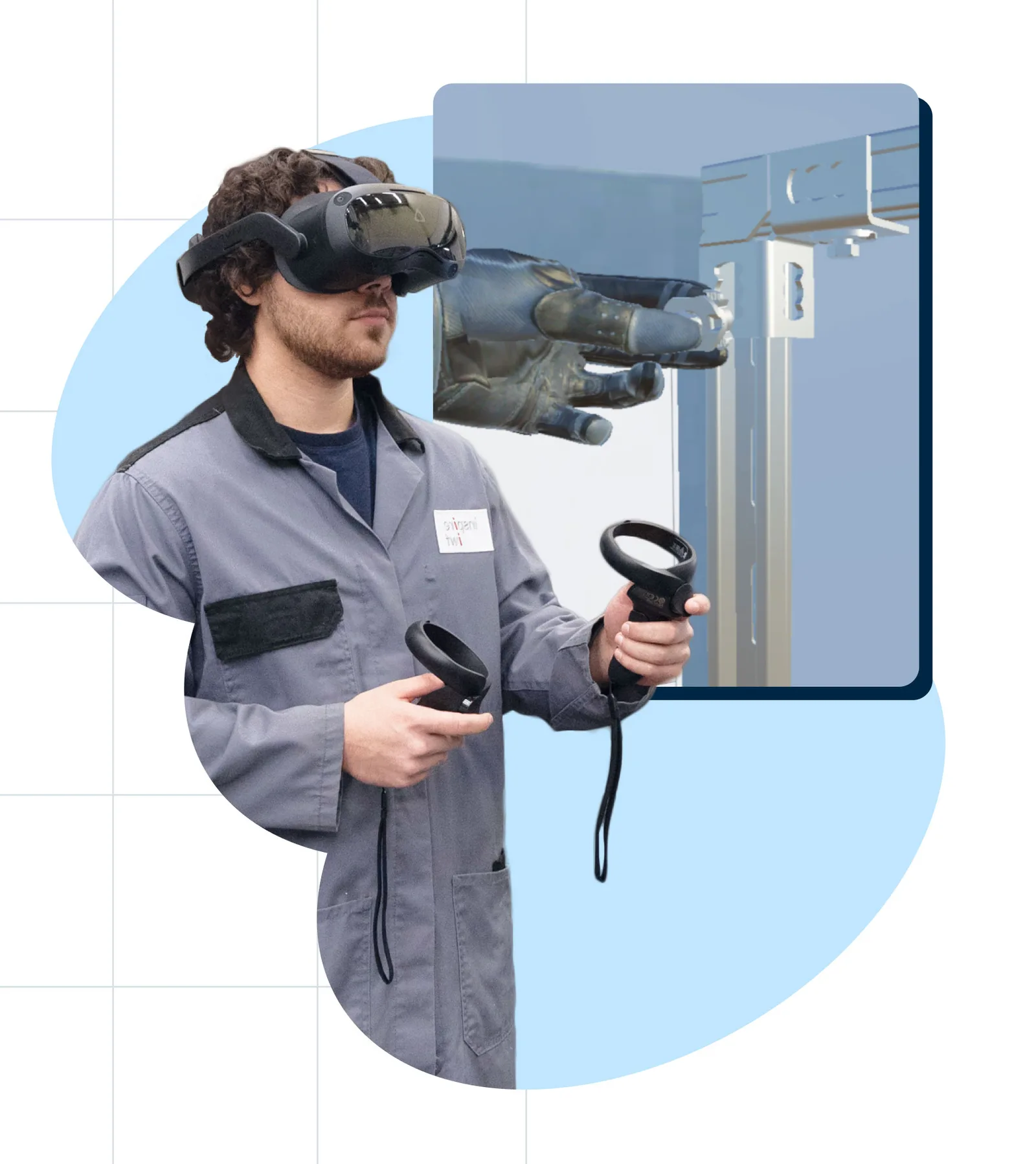
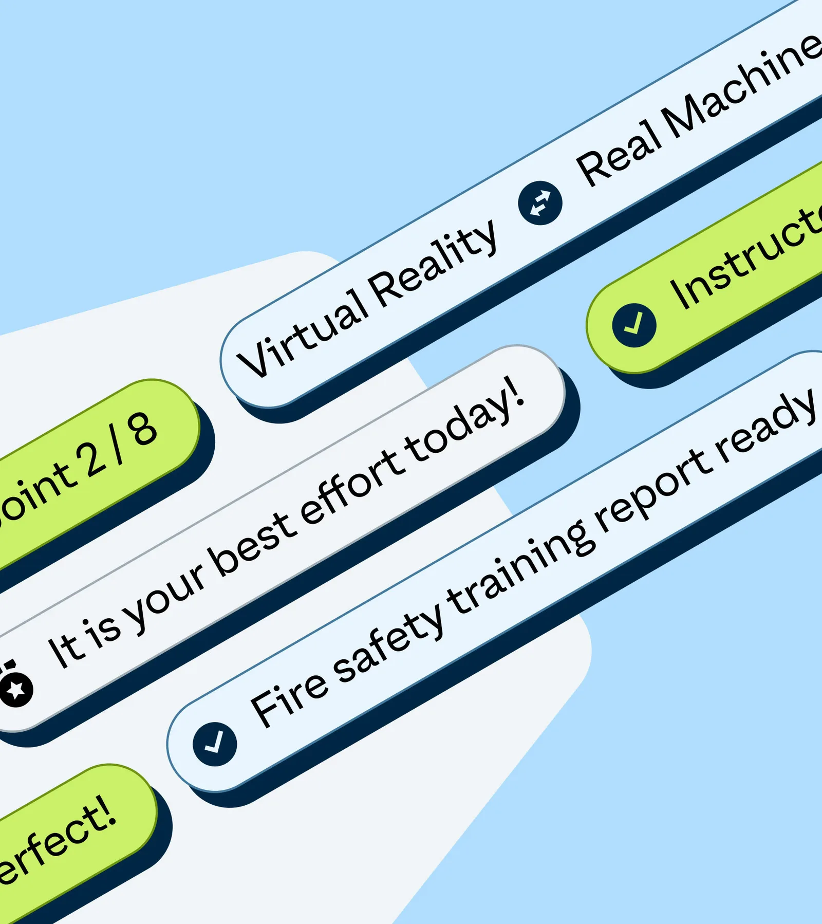
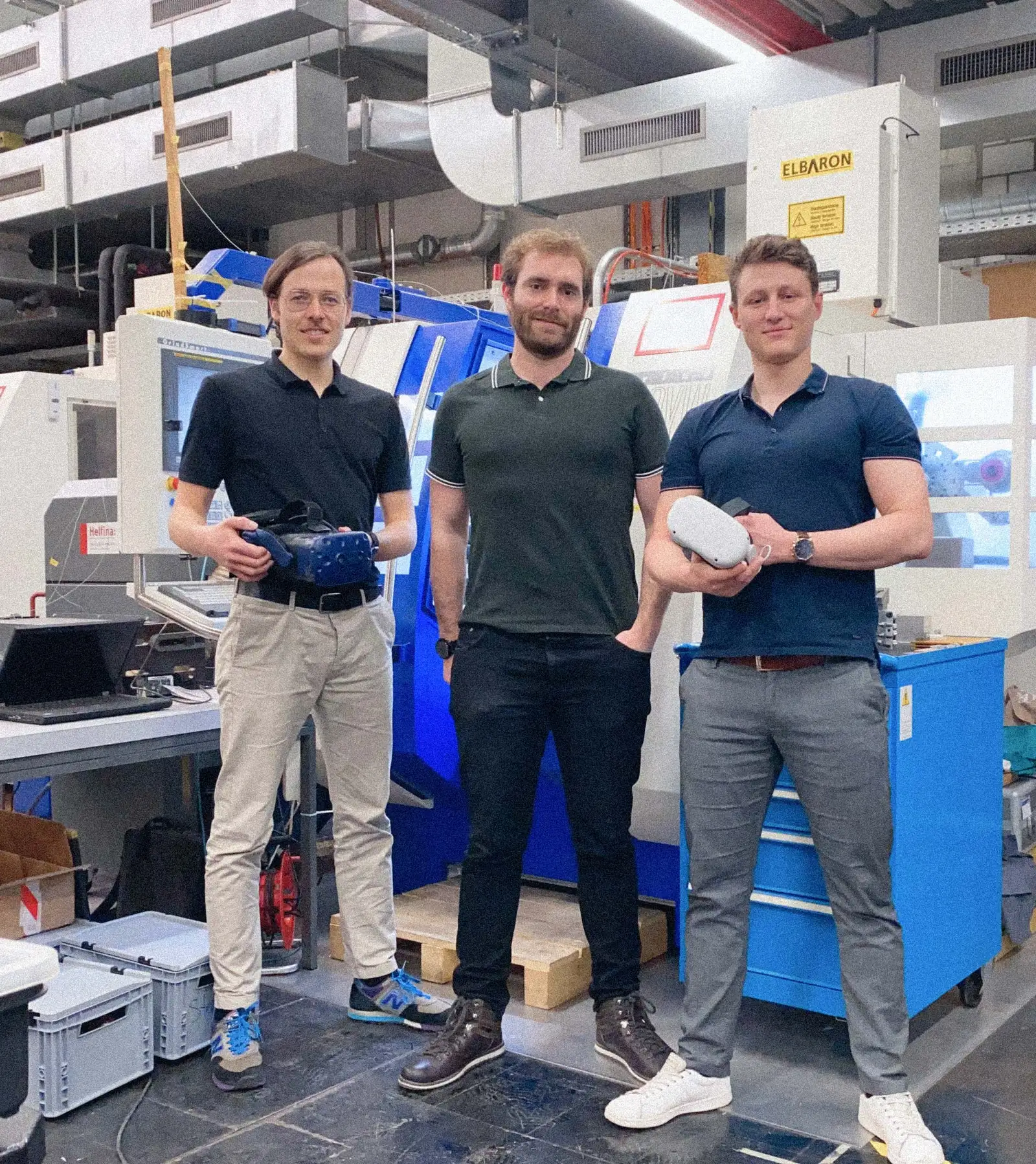
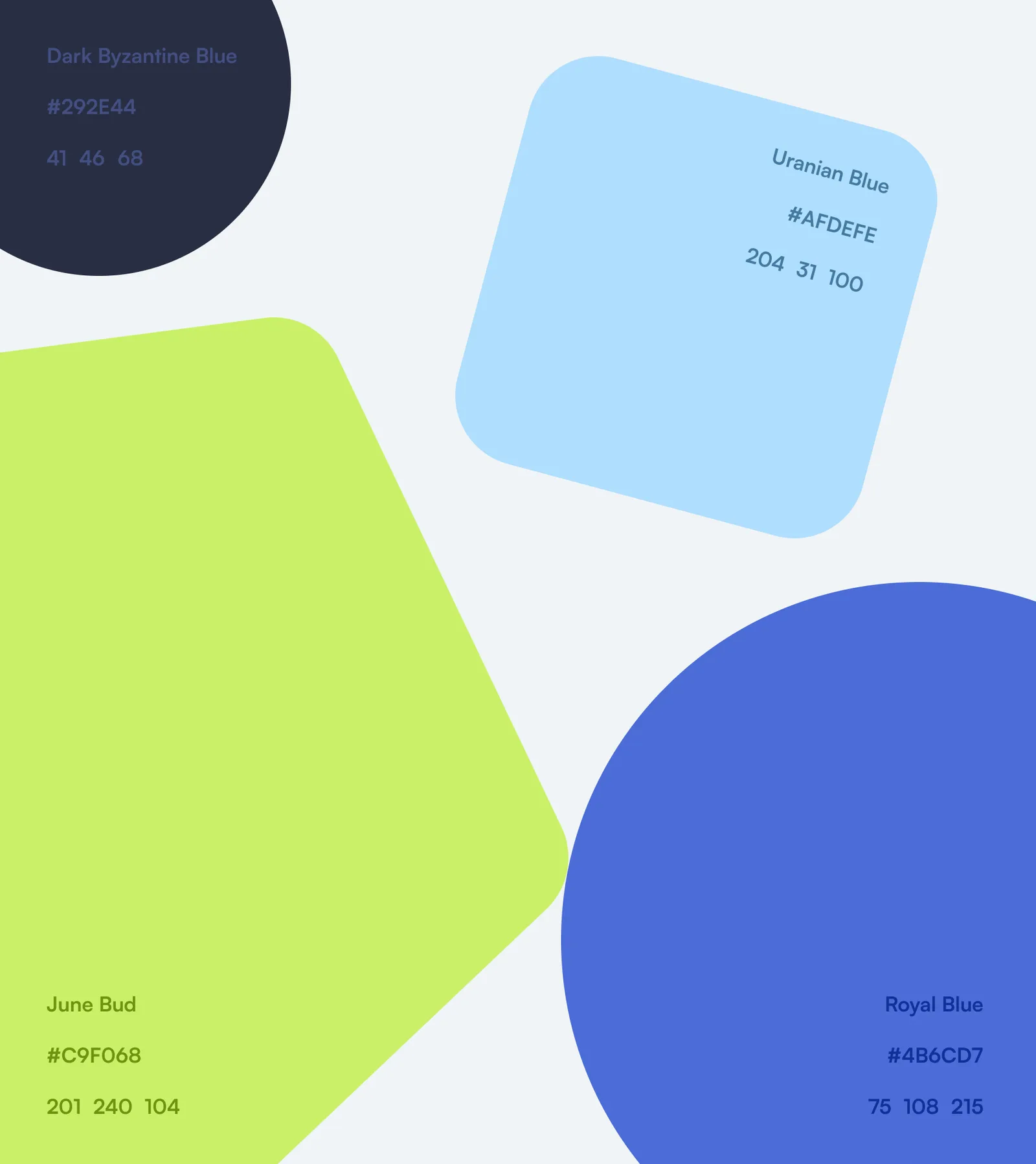
Four colours, each with a job. We updated the logo and set a palette of navy and royal blue for structure, light blue for calm backgrounds, and lime green for every action, from the “Book a call” button to a completed checkpoint.
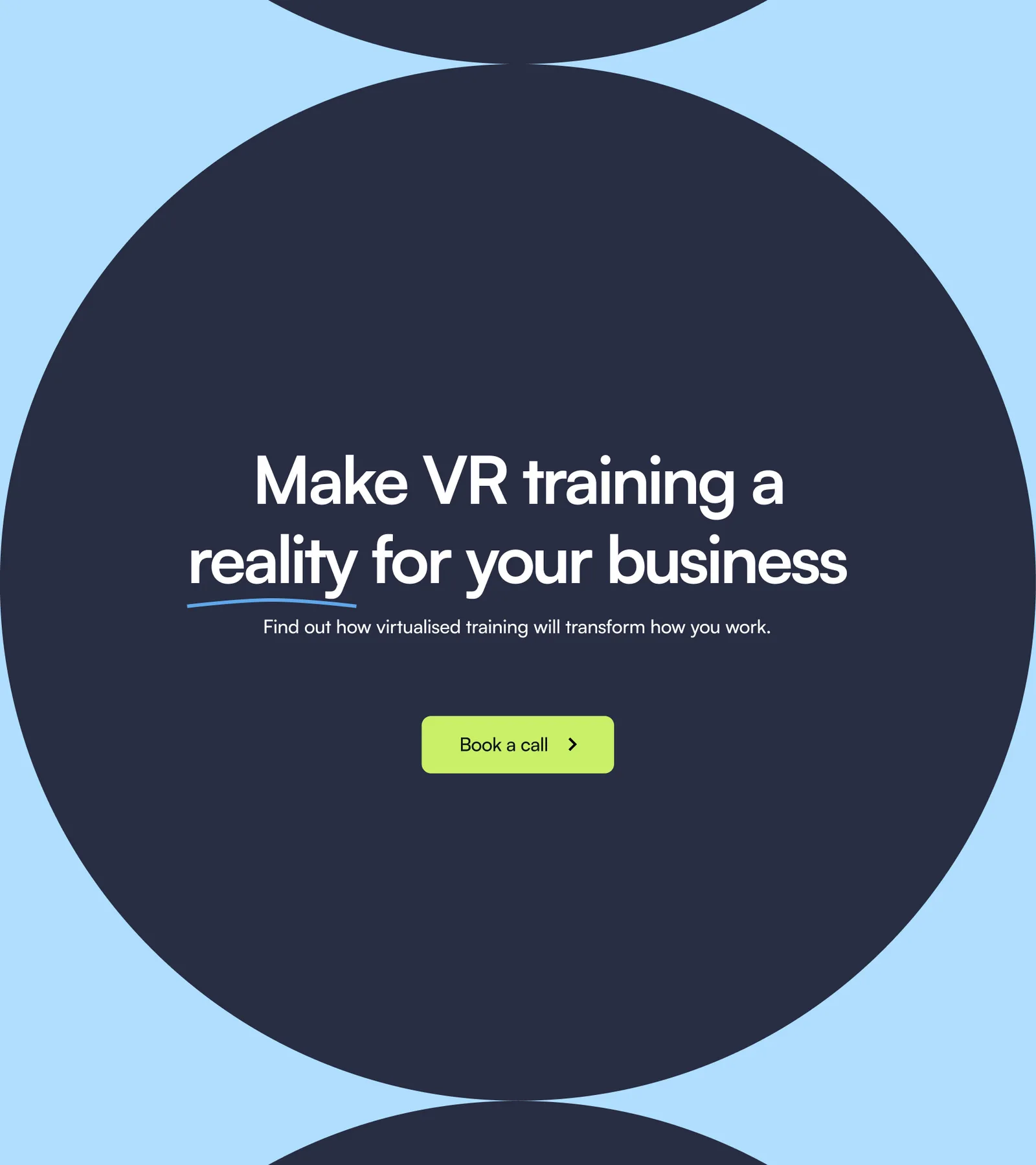
One next step, everywhere. “Book a call” sits in the header and closes the page, so a prospect never has to look for how to get in touch.
Results
#Within the six weeks, AtlasVR had an updated logo, a new colour palette and a multi-page website in two languages, built in Webflow with Weglot and laid out for phones as well as desktops.
"Thanks to our collaboration with SamuylovAI, we were able to create a website that truly conveys the values and importance of AtlasVR on a professional level. Our joint work allowed us to tackle the analysis of our brand’s positioning and visual representation while making sure the messaging on web pages was clear and concise. We have already started to receive positive feedback from our partners and clients!"
– Anastasia Vorontsova, Marketing manager at AtlasVR
"We have chosen SamuylovAI services over an agency offering a standard templated website, and we never regret our decision. Very quickly, they grasped our vision of the product and target audience and helped us improve our positioning and value proposition. This collaboration helped us come up with new data-driven product features – a side benefit that we could not even imagine as an outcome of a project aimed at updating our website and visual identity."
– Valentin Holzwarth, Co-founder at AtlasVR
What transfers
#Agree the story before the pixels. Settling audience, positioning and tone first gave design and build a fixed brief to work to inside six weeks.
A website brief is often a positioning brief. Here the work sharpened AtlasVR’s positioning and value proposition, and in the co-founder’s words even led to new product features.
Let evidence carry the credibility. For a young company selling to industry, sourced figures, client words and awards persuade where adjectives cannot.
Credits
#- Project manager: Denis Samuylov
- Design: Anton Elovikov
- Copywriting: Alex Pett
- Photography: Pavel Lepeshev
- Implementation: Anton Elovikov, Denis Samuylov
- Technology stack: Webflow, Weglot, JavaScript, jQuery
Heading into a pitch, a funding round or a launch with a brand your company has outgrown? We update your identity and website against a fixed deadline. See Design & Experience, or Start a conversation.