Client
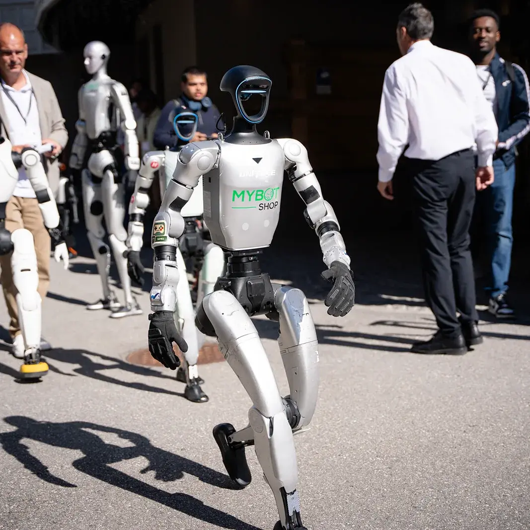
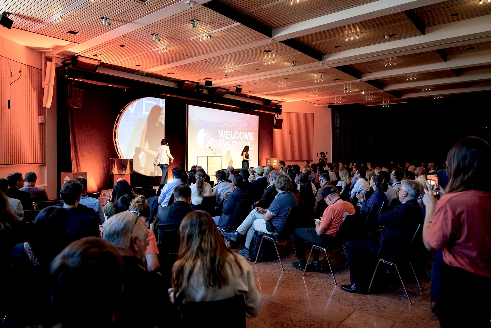
#Davos Tech Summit (opens in a new tab) is a conference on physical AI and robotics. For its 2026 edition, from 1 to 4 July, it went beyond the Kongresszentrum: its Robot City programme placed more than fifty robots in shops, hotels and outdoor locations across Davos.
So the summit’s brand had to work on a stage, in a supermarket aisle and on a gravel car park, and be readable from a few steps away or across a square.
Challenge
#The summit already had a logo, palette, typeface and style guide. The organisers wanted a consolidation of the brand, not dilution: physical formats, from outdoor flags to freestanding signs, that gave the core logo room and added nothing that competed with it.
The project had a fixed production budget, twenty locations, three stages and five weeks to delivery. Everything had to survive outdoors, stay clear of the stage screens and cameras, and give every robot the same kind of sign. The venue signs also had to be a template the client’s own team could print and install.
Our approach
#We built every format from three parts of the existing logo: its semicircle, the gradient and generous empty space.
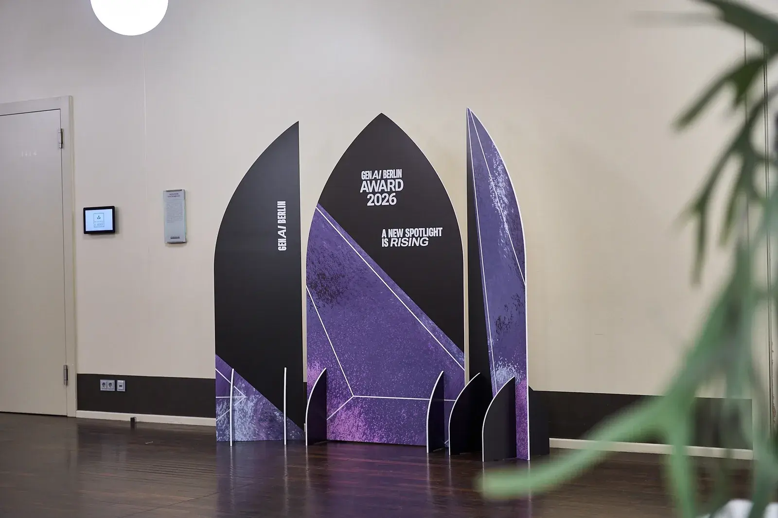
We presented three stage concepts and several signage and navigation options, each with a manufacturing route and a cost, so the organisers could weigh look against cost. They chose the cube installation; we then simplified the signage to fit the budget and cut the flags down to a logo-only design that can be reused.
The flags
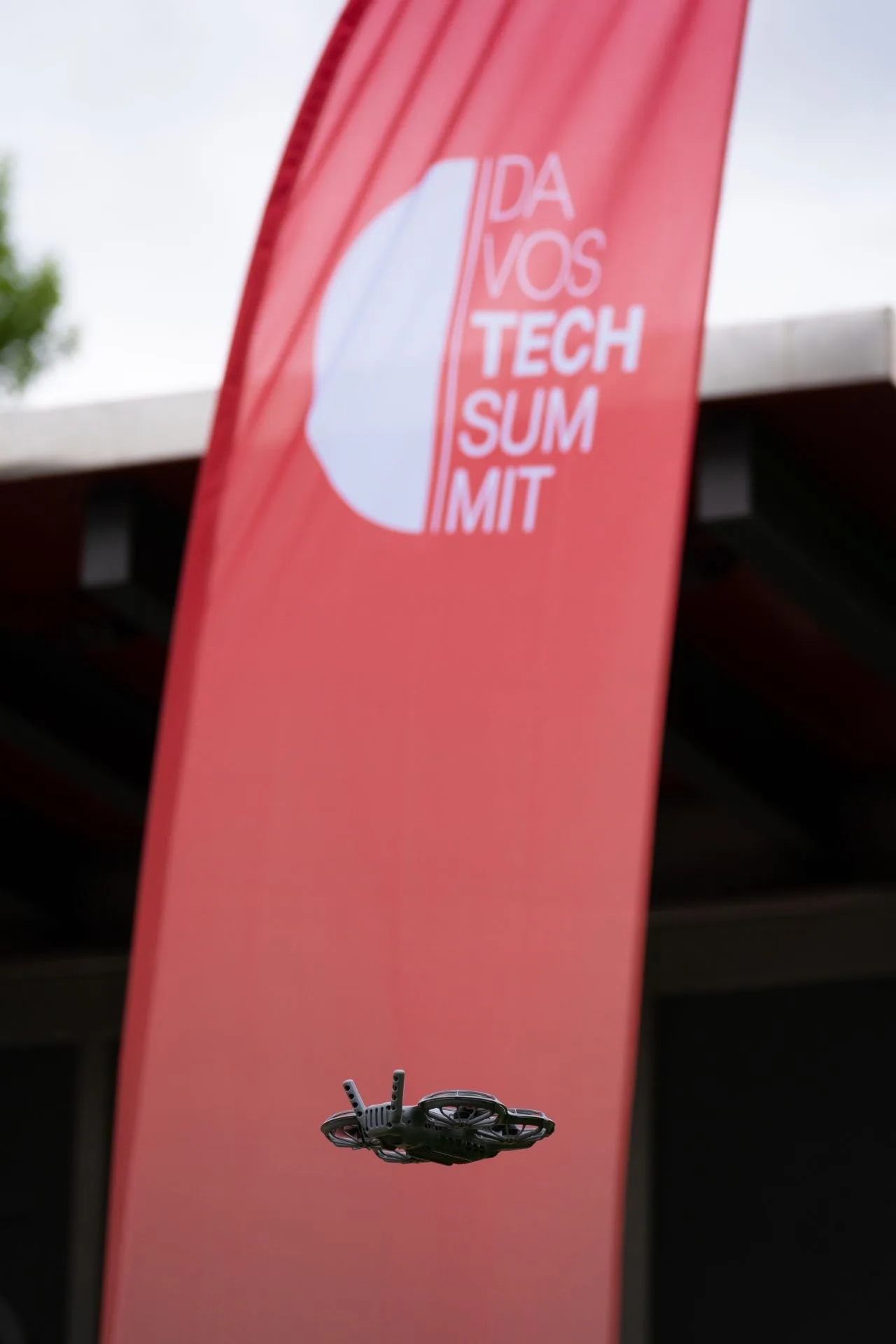
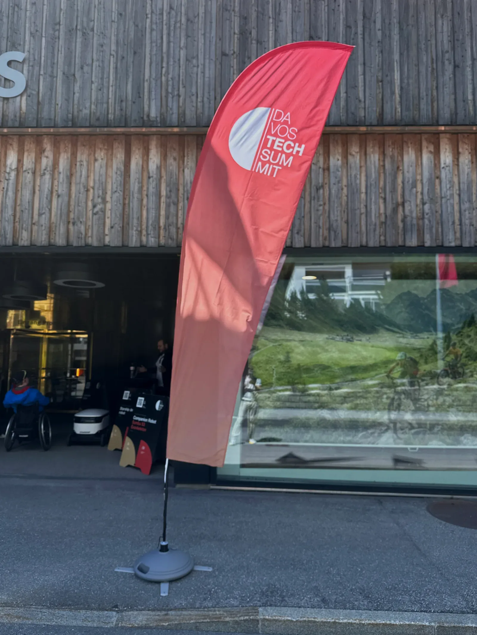
#Twenty feather flags marked the Robot City locations: smaller ones along the streets, taller ones in open spaces where they had to be seen from a distance. They carried the logo without a year or location-specific wording so they could be reused, and fillable bases held them on asphalt, gravel and grass.
The robot signs
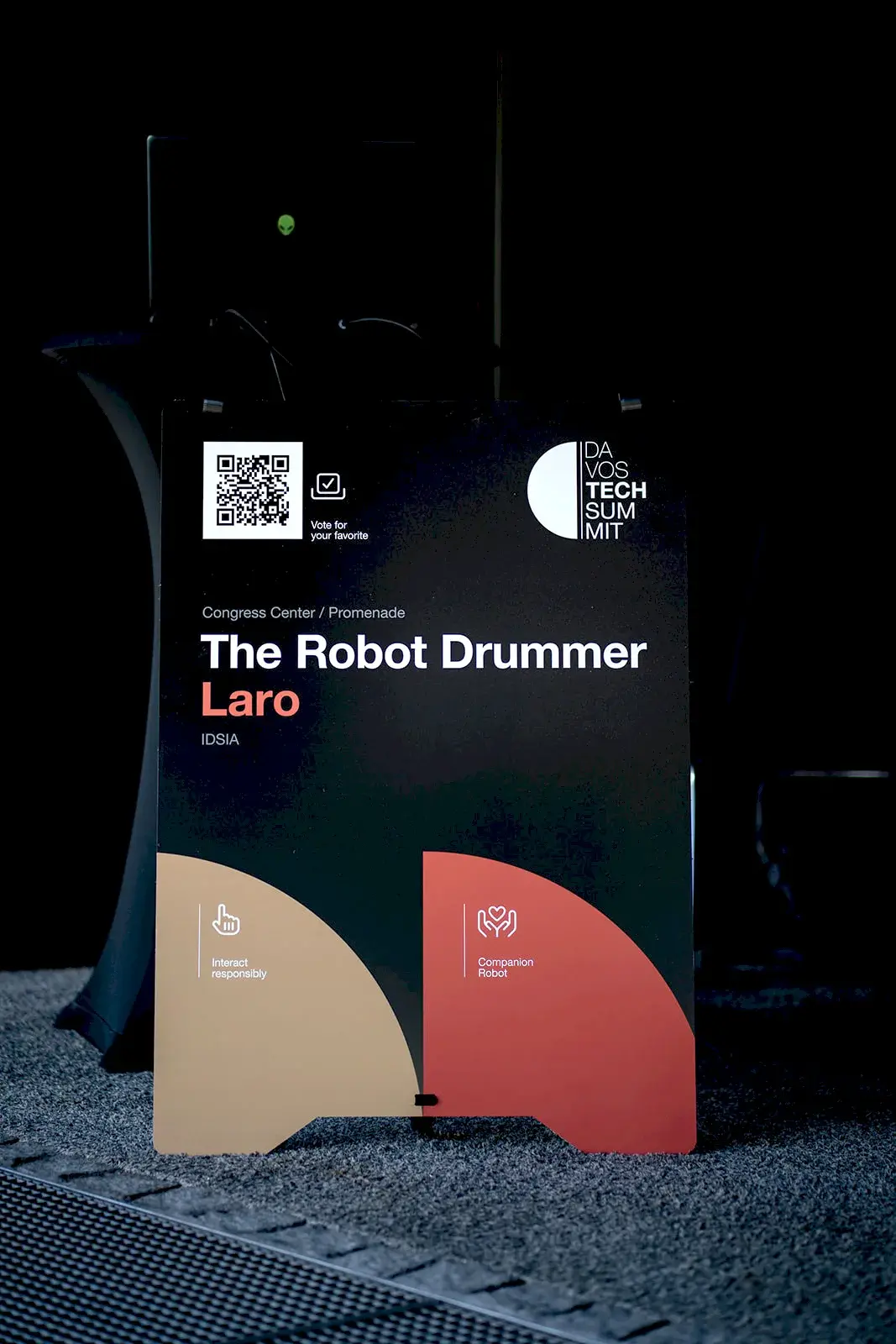
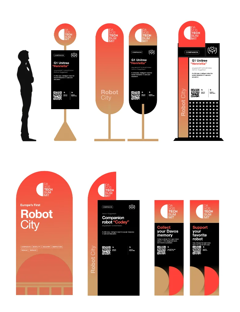
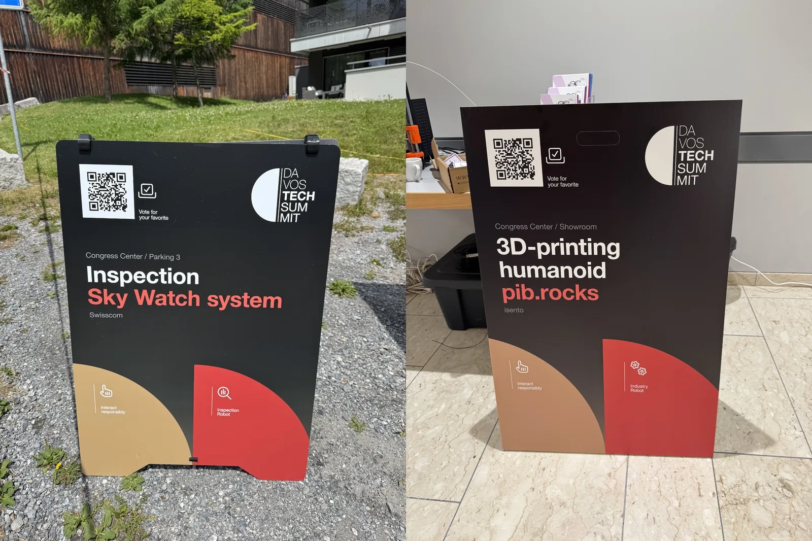
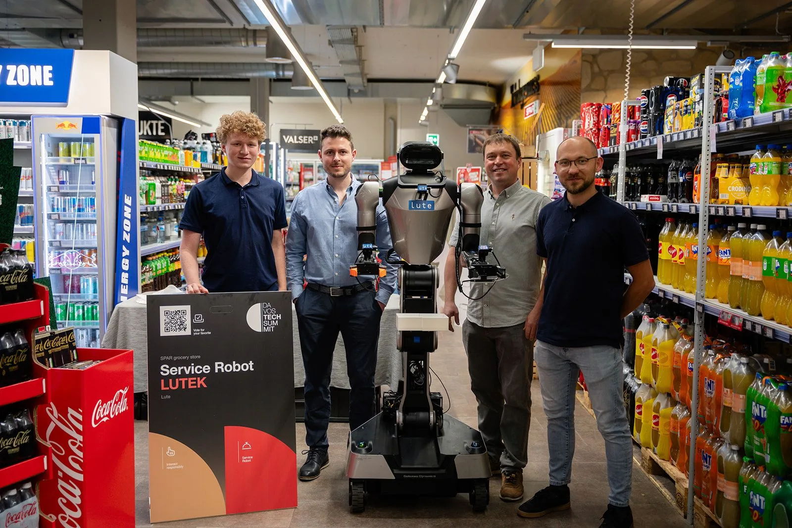
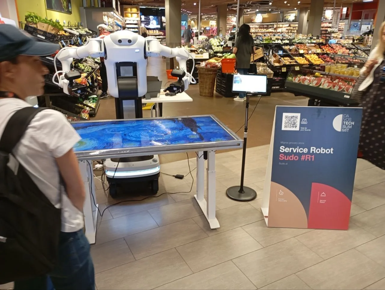
#Visitors needed to recognise a Robot City stop at a glance and vote for their favourite. Forty-four panels shared one layout: location, robot name, operator, category, a note on interacting responsibly and a voting QR code. Only the category icon and label changed; the layout and colours stayed the same.
The cubes
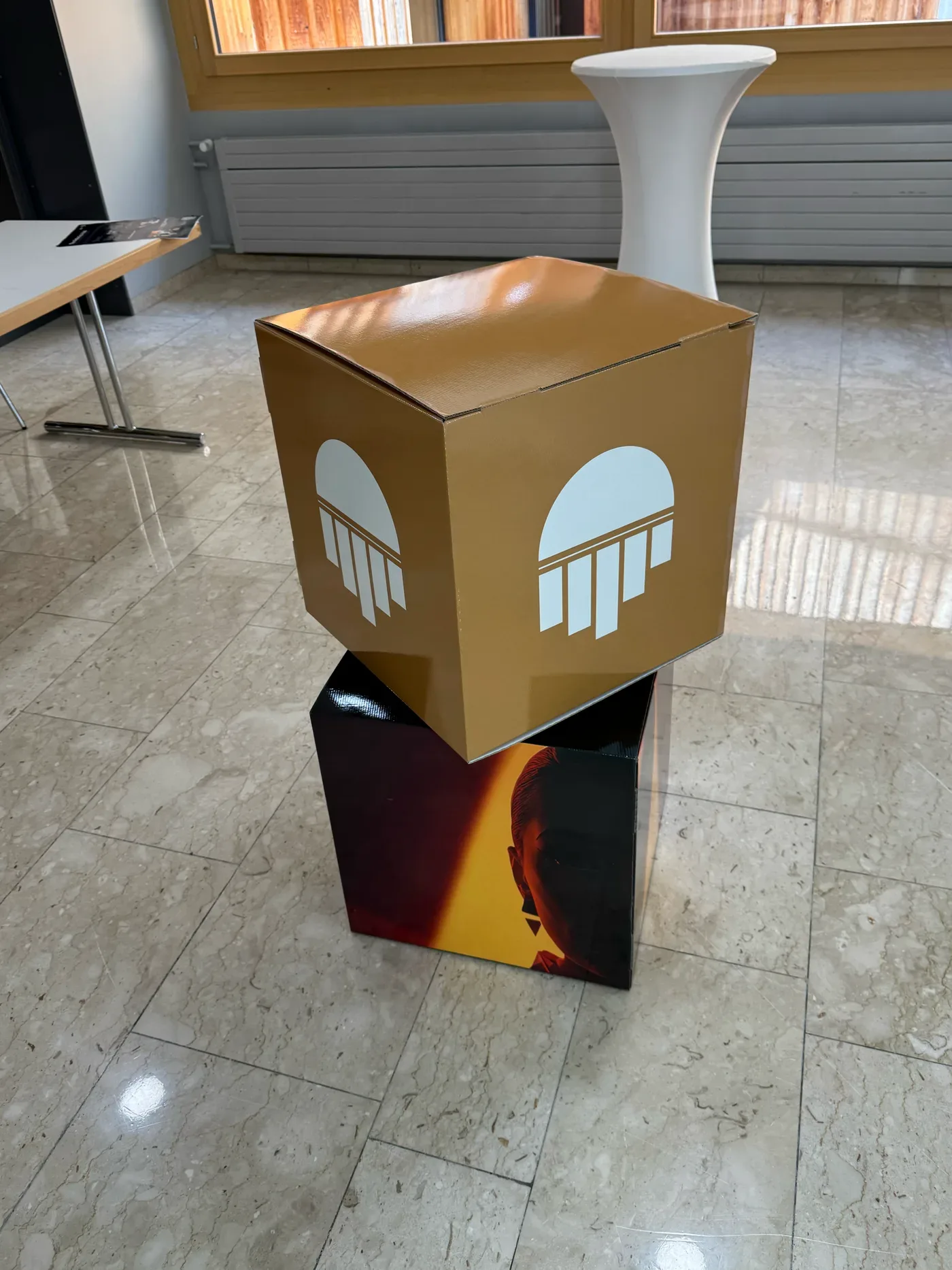
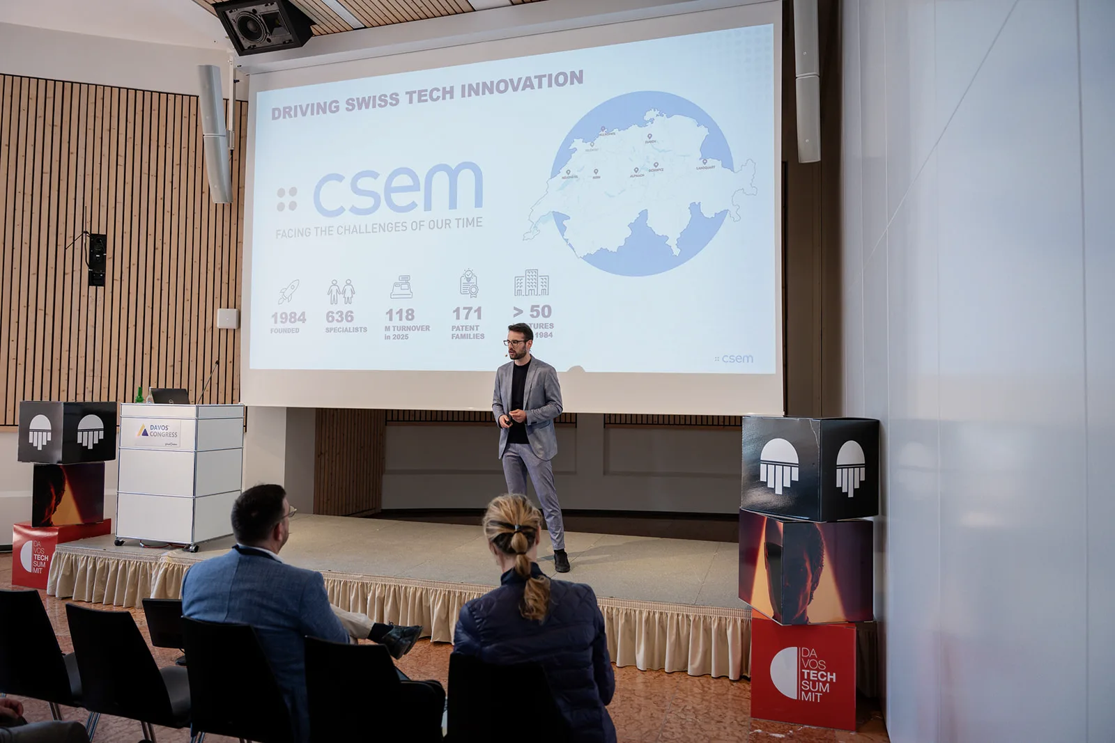
#Twenty-four printed cubes formed stage columns. Their faces alternated between the semicircle pattern, the brand colour and portraits of people and robots, so all three stages could share one kit.
The navigation kit
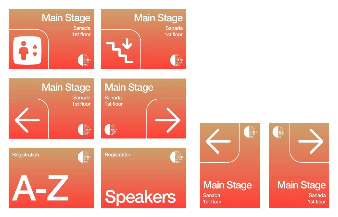
#Room signs, zone headers, reception signs and directional arrows shared vertical and horizontal layouts on reusable bases with replaceable front panels. The client’s own team printed and installed the pieces it needed, which kept the cost and the timing in its hands.
What transfers
#Design for the build, not the screen. Sourcing the manufacturer, specifying materials and placing the production order were part of the design work. That is why every piece was on site within five weeks.
Discipline beats novelty. A few forms from the existing logo, applied everywhere, made twenty locations and three stages read as one event.
Plan for the next edition. The flags carry no year and the navigation signs have replaceable front panels, so both can return next summer.
For the robots themselves and what it took to run them around town, read Denis’s recap of Davos Tech Summit.
Planning a summit, launch or stage installation? We take your brand from the style guide to the signs on site, including the manufacturer, the materials and print-ready templates your team can reuse. See Design & Experience, or Start a conversation.